
better design series
Better cycling tour website
Background
I came across this website when I joined my friends on a cycling trip in Taiwan a couple of year back.
It is a website by Giant Bicycles where they organize cycling tours within and beyond Taiwan, and visitors can search for and book those tours.
It worked fine but the search controls are taking up a big chunk of the real estate and I think the whole user experience for doing the search & filter could be improved with some UX and visual tweaks.

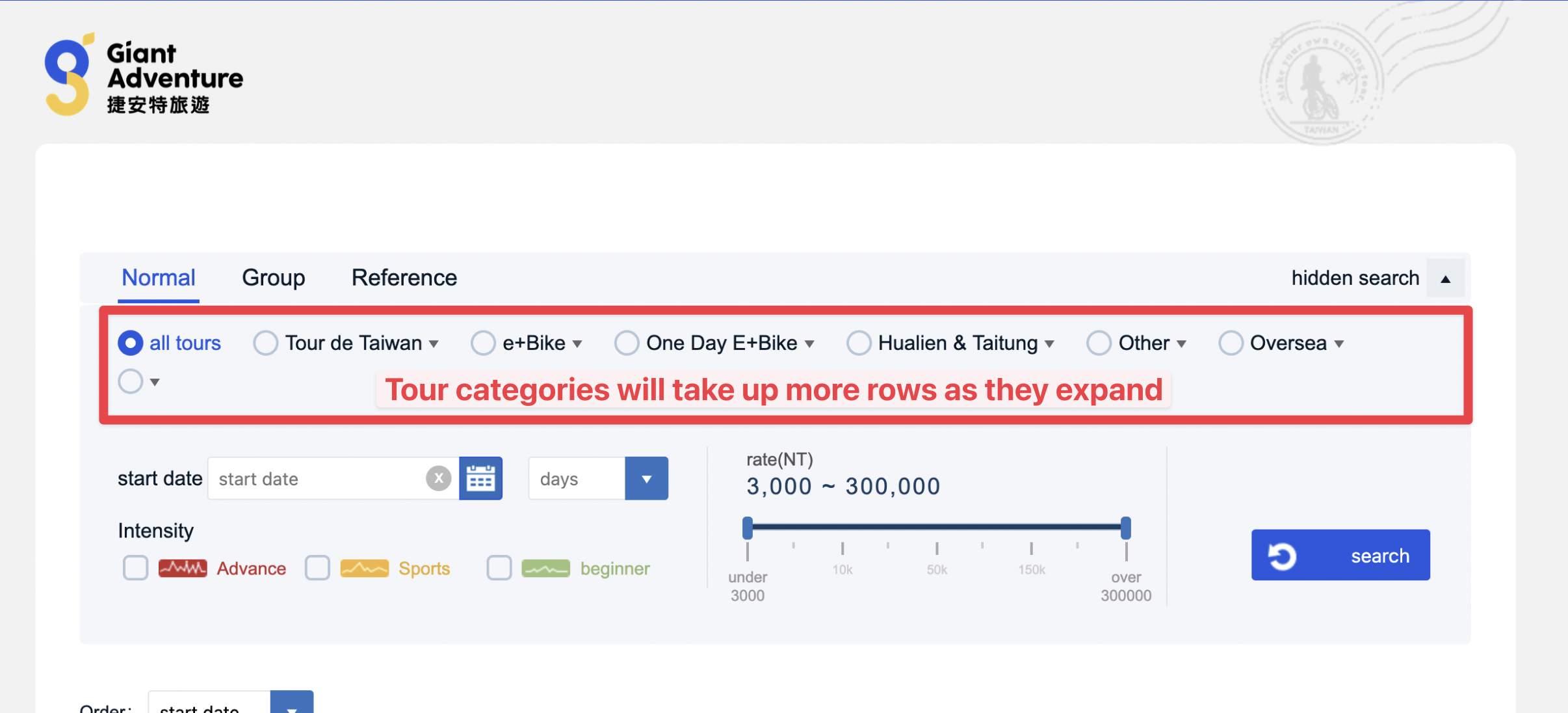
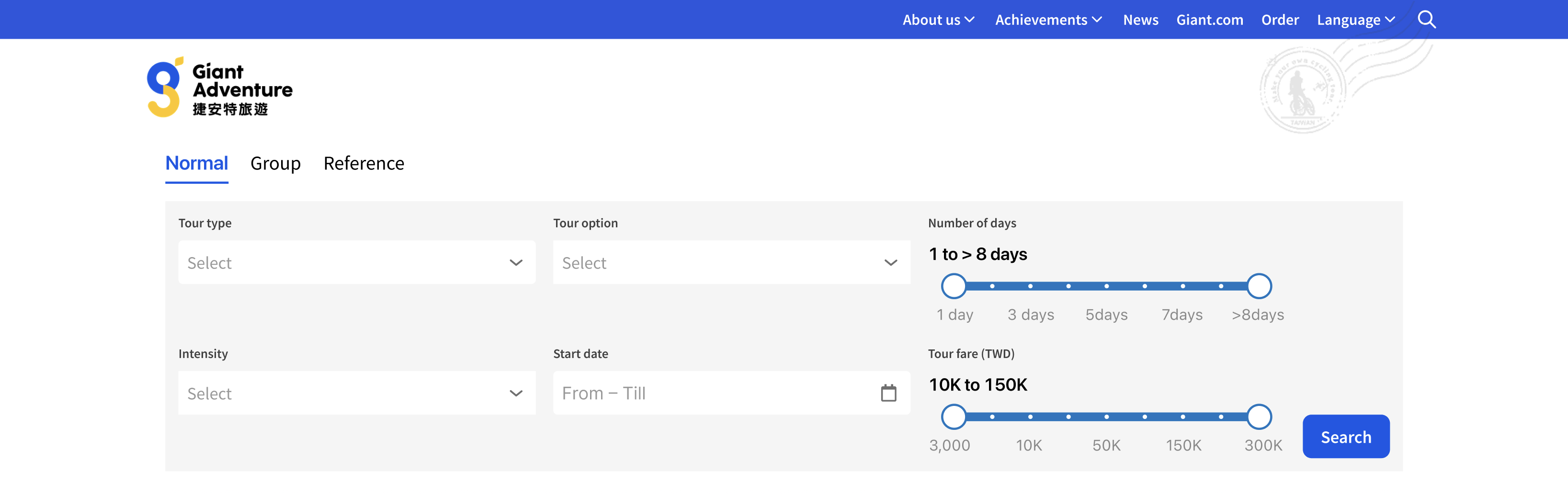
Problem #1
The cycling tours are classified by categories and sub-categories.

For example, there’s a category called `Tour de Taiwan` where you will cycle the circumference of Taiwan in 9 days. Within it are sub-categories – `From Taipei`, `From Kaohsiung`, `From Taichung`, etc. – that indicate the flag-off locations.
Currently, each category is listed as a radio–select field: each category is a single-select field which has a radio button beside it. This means you can only select one category at anytime for searching.
Within the dropdown options are the sub-categories with an “All” option. “All” is selected by default.
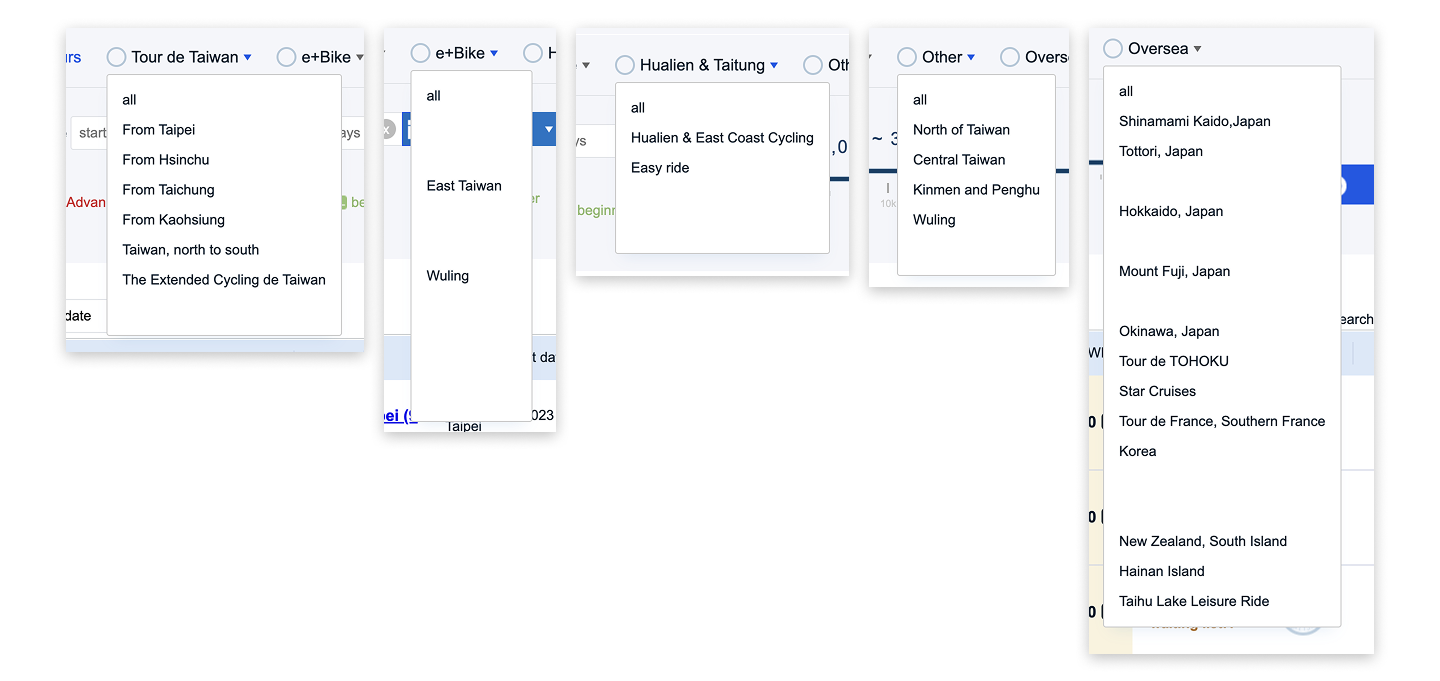
The problem with such layout is that it’s not scalable. There are now 6 categories and it’s taking up 2 rows already. If they are to expand their categories, it will end up taking more rows.
Solution: Version 1
Before I started sketching out ideas, I list down the main outcome for the category selection:
- When no category or sub-category is selected, we will display ALL the tours;
- When just a category is selected, we will display ALL the tours under that category;
- When a sub-category is selected, we will display just the tours of under that category.
First idea I came up with was to group all the categories and sub-categories under one long single-select field.
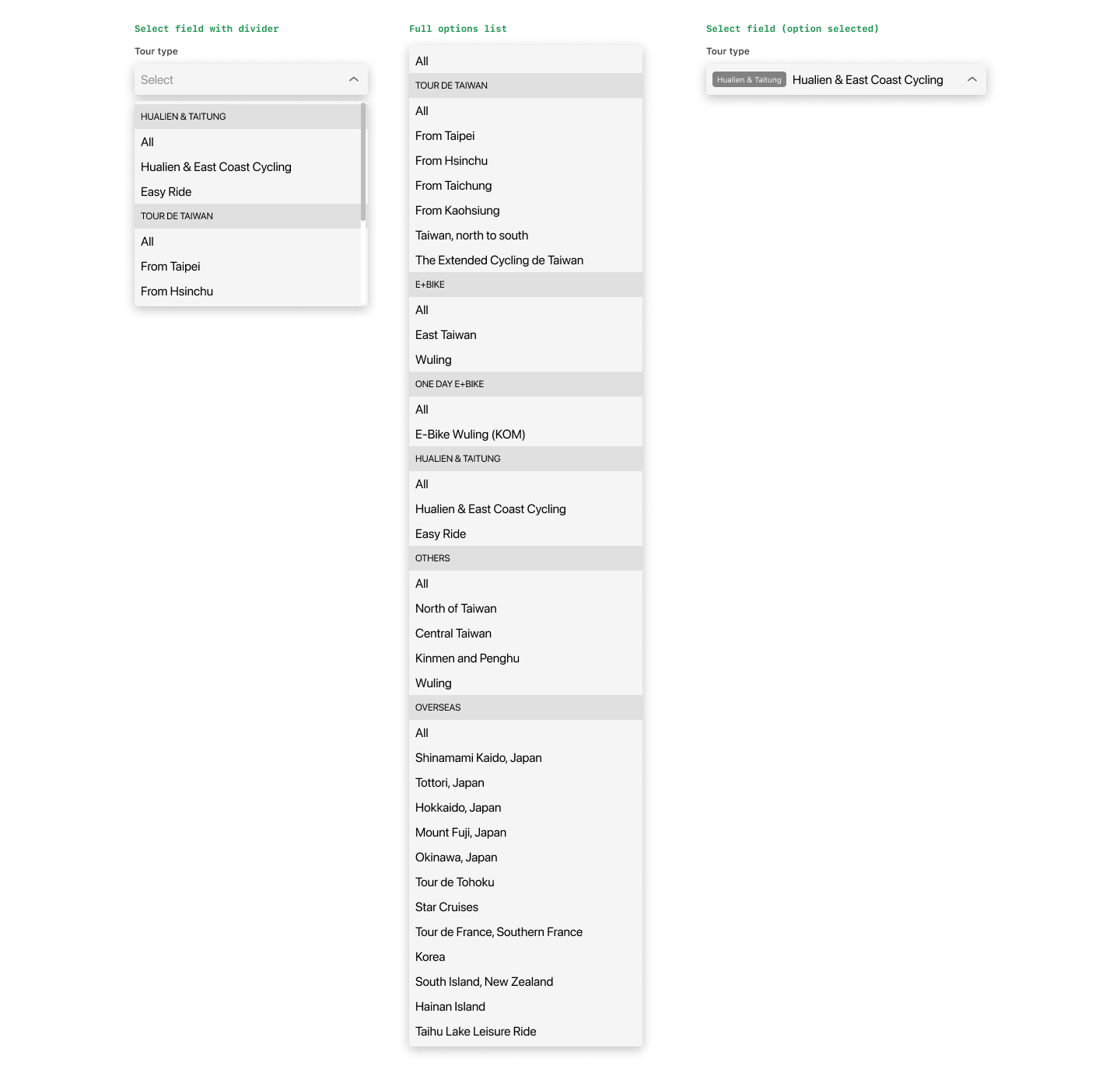
The categories act as dividers to visually separate them.
You will have the same options, plus the “All” option. This “All” option allows the system to show all the tours of that category as we are using the category name as the divider.
You can see from middle column above that this list would be very long: 11 + 5 + 1 + 2 + 4 + 11 + 3 = 37. To scroll down the list for searching would be rather tedious.
I’ve thought of adding a search field inside the dropdown, but I think visitors – like myself – prefer to see the available options rather than to search for some particular sub-category, especially when I’m not sure what to look for.
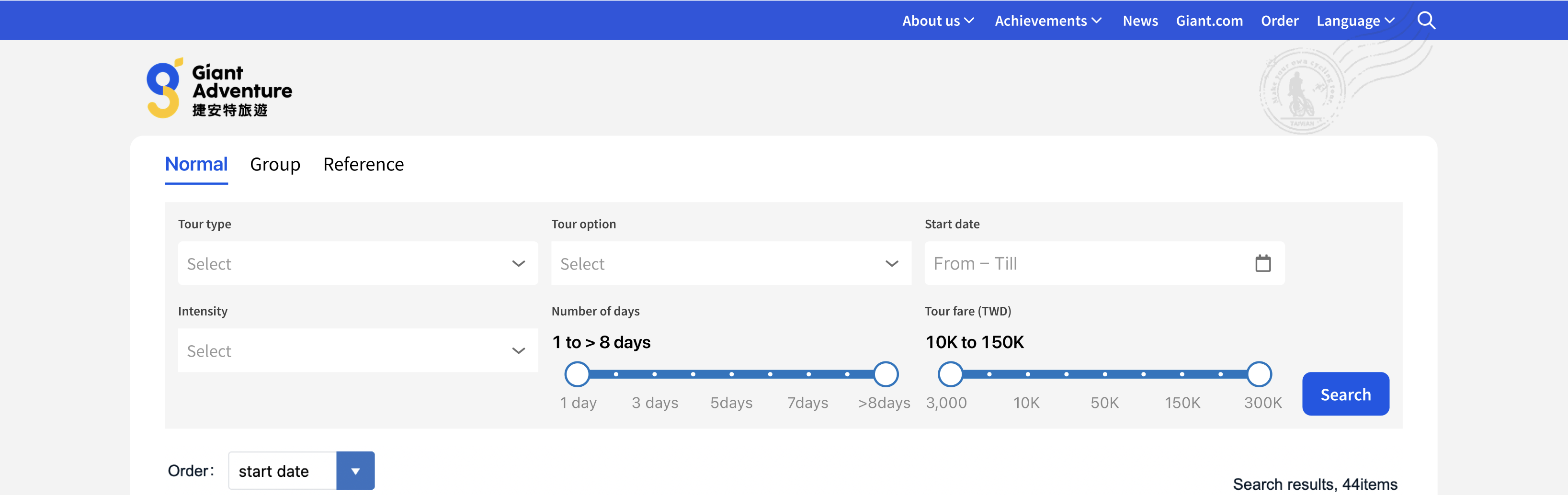
Solution: Version 2
The 2nd idea is to have 2 single-select fields: 1st one for the main category called “Tour Type”, and the 2nd one for the sub-category called “Tour option”:
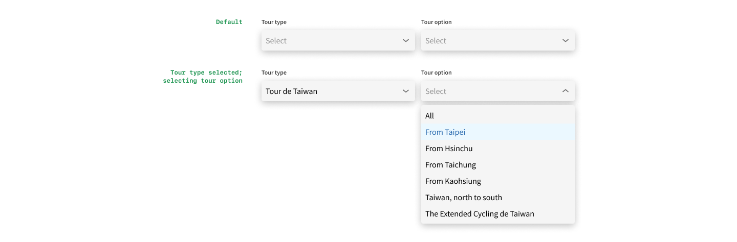
When no category is selected, the sub-category field is disabled from selection. When a category is selected, the sub-category field becomes active, and the visitor can browse the options of this category.
This works better than Version 1 as the list becomes manageable. It will not be tediously long and no search field is required.
And we will always have only 2 select fields even when the organisation increases the categories, making it very scalable. In fact, we could probably make the sub-category a multi-select field, allowing the visitors to see tours of multiple sub-categories at one go.
Problem #2
Right now for the “# of days” option, there are a couple of options, like `< 3 days`, `3-5 days`, `> 8 days`, etc., which is fine when you are just searching by this field.
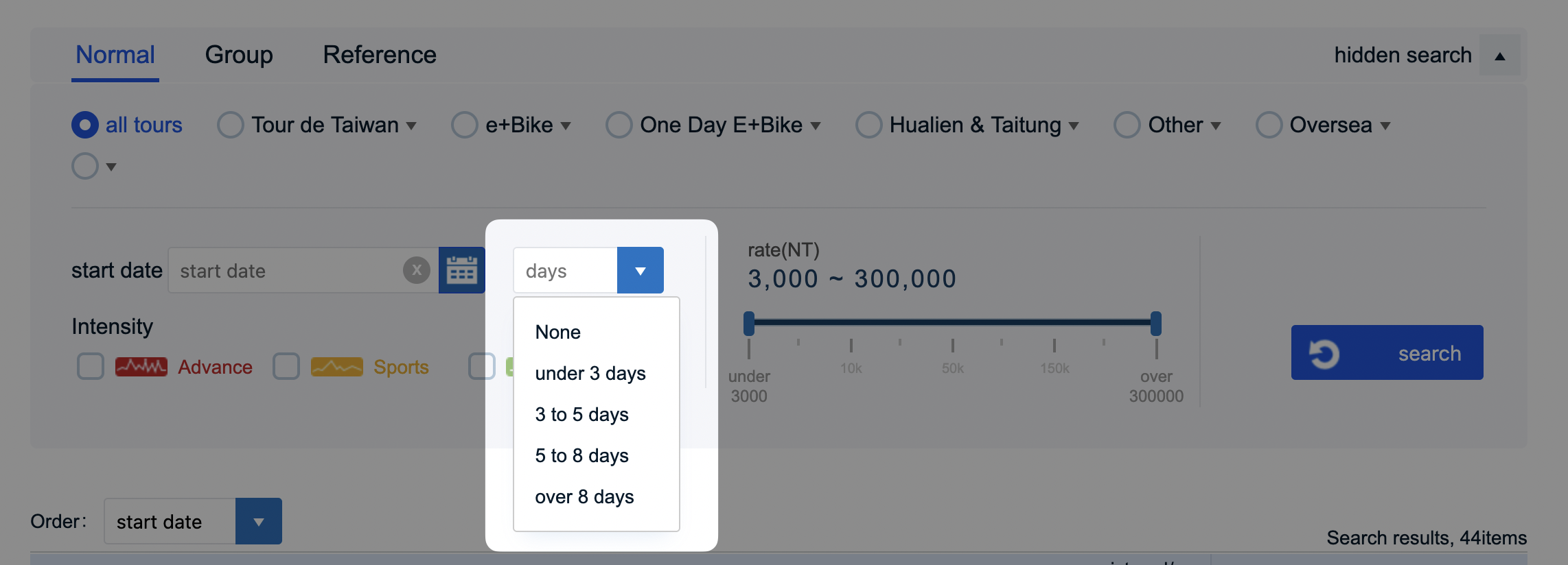
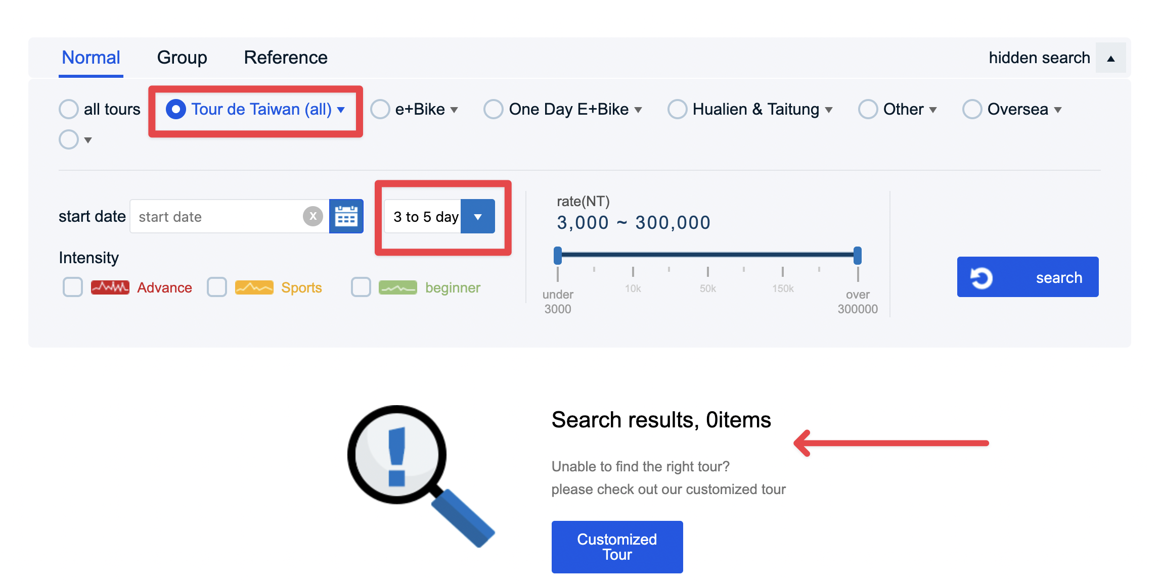
The problem comes when I select a category, say `Tour de Taiwan` and then select one of the options from “# of days”, say `3 to 5 days`. No results are found because the 2 conditions conflict each other: All `Tour de Taiwan` tours are 9 days long but you want to look for something between 5–7 days.
Proposed Solution:
Instead of a drop-down select element, I’m proposing a slider element. This way the visitors could finetune the minimum and maximum number of days for searching the tours, and not restricted by the fixed options.
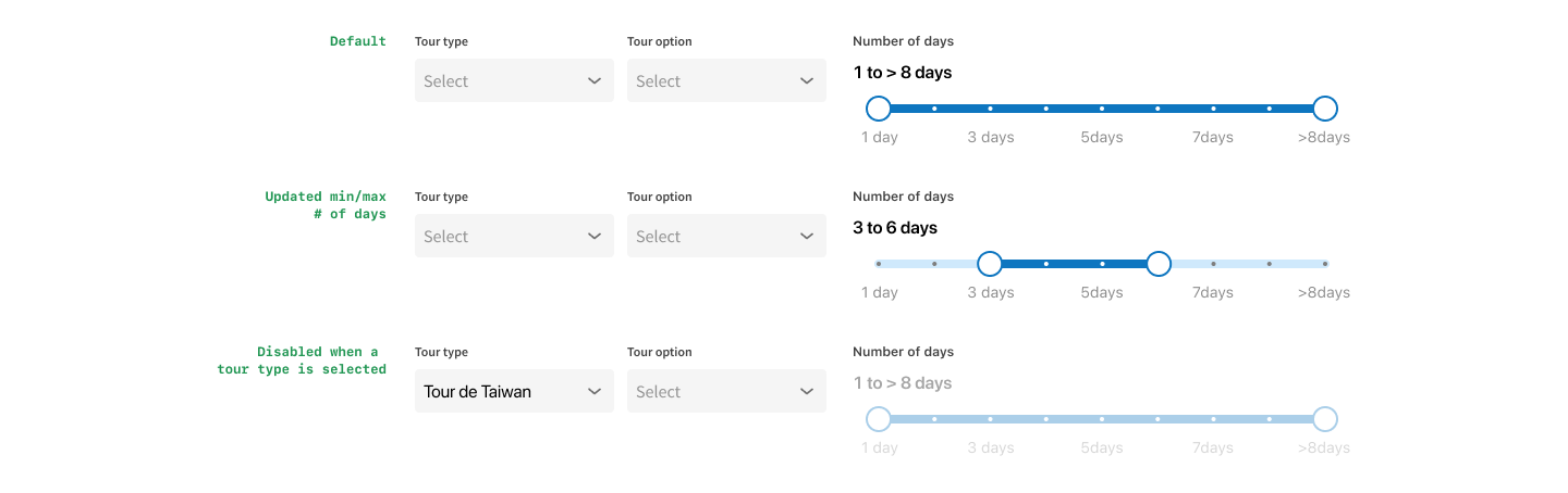
When category is not selected OR if category = `Overseas` , then allow visitors to use adjust the “# of days” option. Why allow for `Overseas`? Because the # of days differ widely for overseas tours, thus they need to have that filter option.
Then, when a category is selected, eg. “Tour de Taiwan”, then the option becomes disabled (see 3rd row).
Then again, some of the tours in those categories with fixed # of days might change in the future with different ones, so I could be wrong and it’s my assumptions for now.
Problem #3
The level options as checkboxes are taking up lots of horizontal space as the icons themselves are wide.
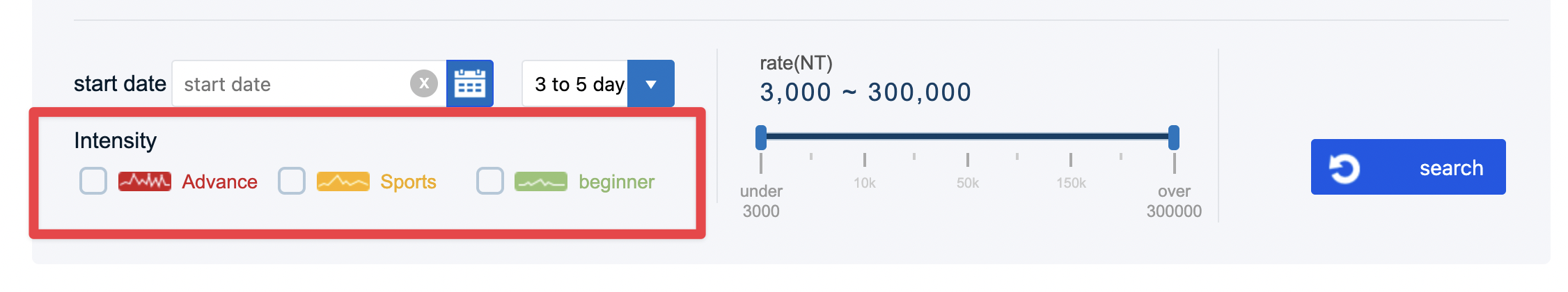
Proposed Solution:
Turn them into a multi-select field, with probably a shorter icon or simple illustration. I think the illustrations are unique for this website and should stay.
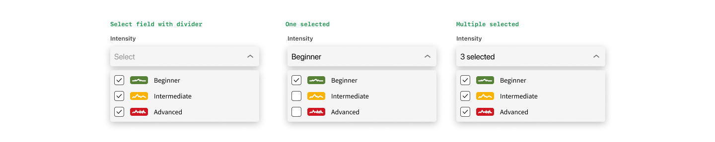
When only 1 option is selected, system will display it’s name; when multiple are selected, system will display “X selected”. It will keep the select field at its current height without needing the display all the options.
Problem #4
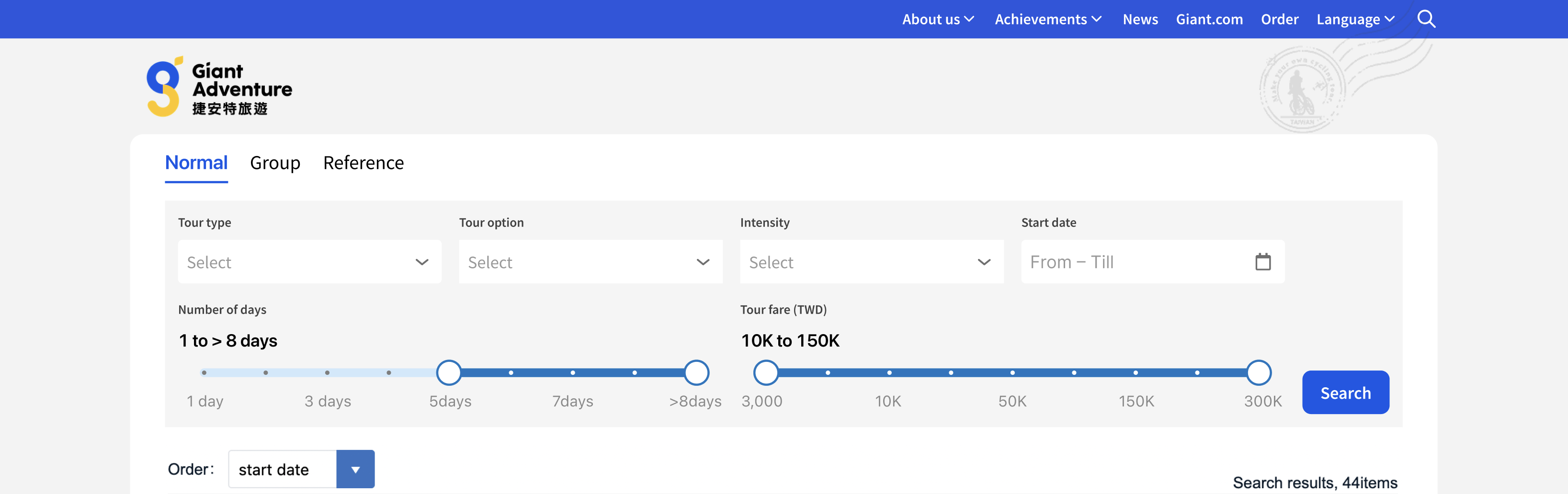
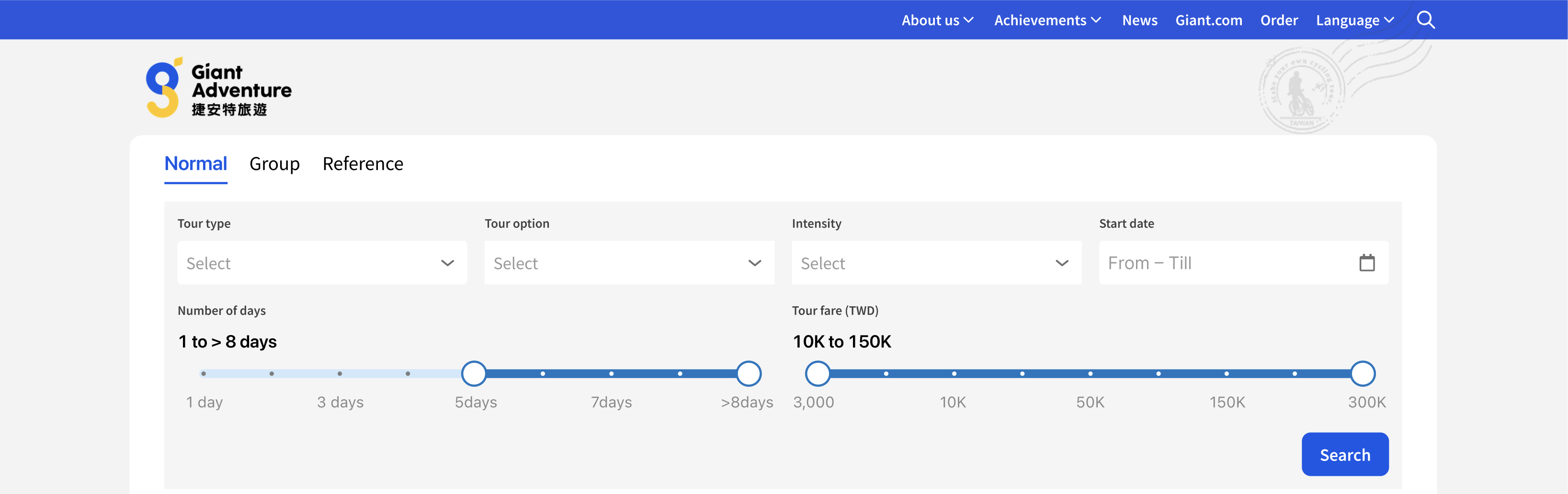
The current layout is giving up lots of space at the top and both sides to waste.

Proposed Solution:
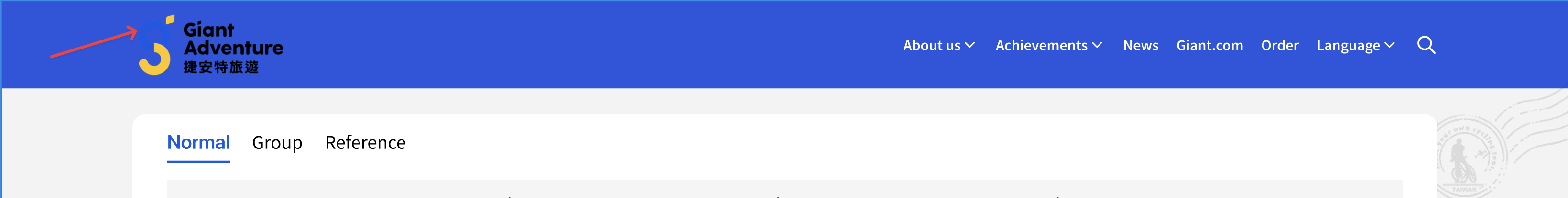
I initially wanted to move the logo up to the top nav, but that meant tweaking the color of the logo because it started to blend into the background:
Instead, I kept the logo and the background illustration but increased its width, reduced the top padding of the white container; and took out the tabs out of the search group so it’s clear that they are not totally related to each other; so that each tab could have different filter options.
I explored various ways of displaying the new options:
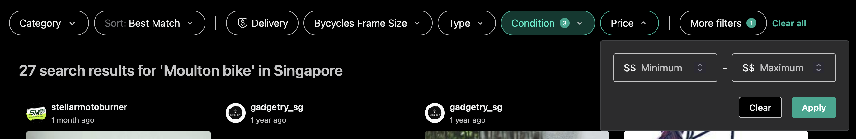
 But I still wasn’t quite satisfied with the outcome. Until I saw how Carousell lined up their filter options horizontally in just one row:
So here’s the final version that I came up with:
- filter options lined up horizontally;
- removed the search button, which means results are generated in real time while the visitor changed the filter options;
- “Reset filters” text button appears when there are at least one filter options.

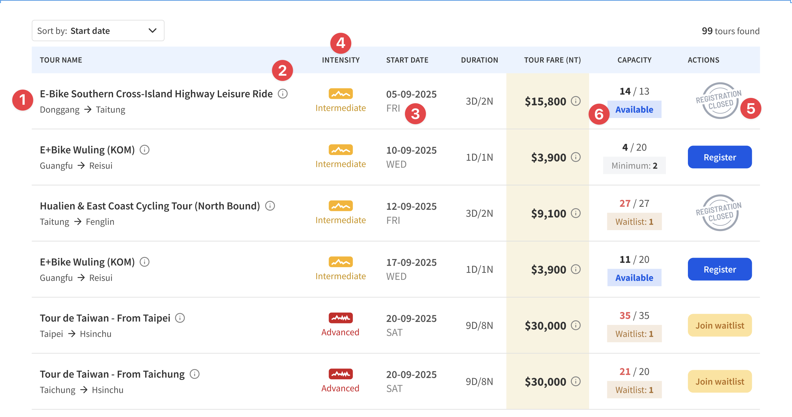
Problem #5
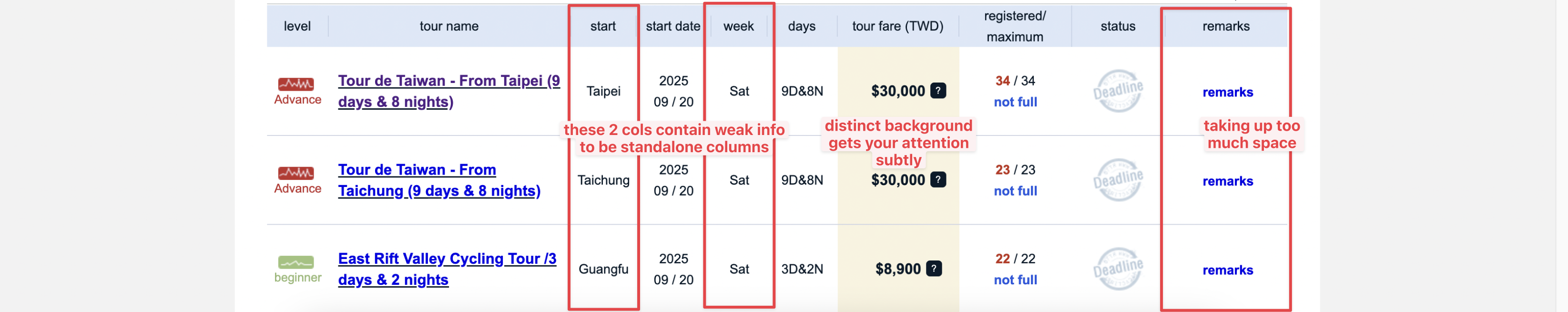
What I like was that the “Tour fare” column has distinct background color that subtly brings your attention to it.
The remarks col is taking up too much space and the information are usually the same.
The “Start” col and “Week” columns are weak information that probably didn’t need to have standalone cols for them.
Proposed Solution:
- Have a longer space for the “Tour name” + show the starting and ending town name when possible;
- Places the remarks under an `info` icon next to the tour title;
- Combines the “Date” and “Day” into 1 column;
- Moves the “Level” column to right of Tour name and renaming it “Intensity“;
- Refreshes the illustration for “Deadline” (which is not that clear) and changes the copy to “Registration closed” (which is clearer);
- Tweaks the info chip below the capacity.
Putting them altogether
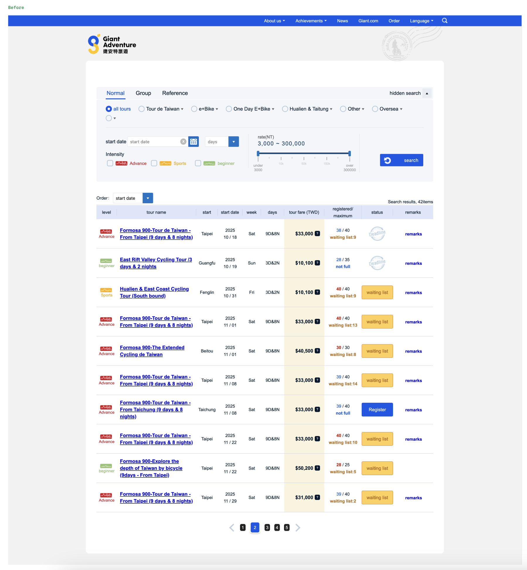
This is the before…
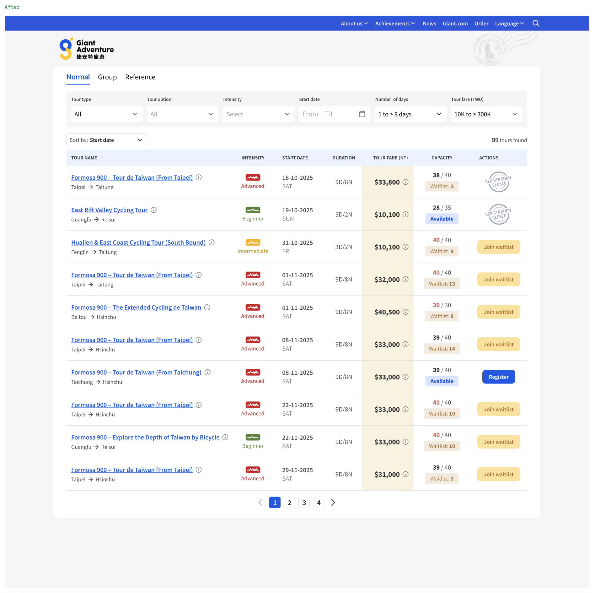
This is the after…
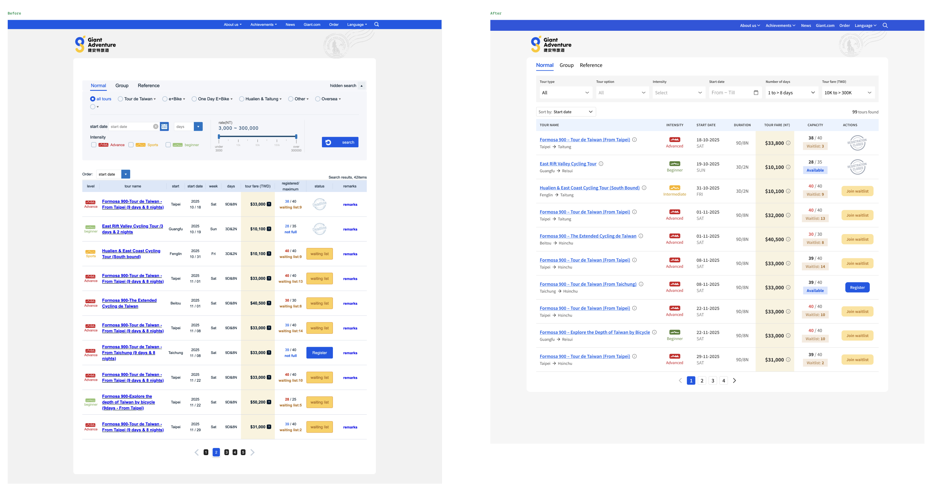
And putting them side by side…
It has been fun re-imagining how it could be redesigned for a cycling tour site that I come back regularly to check for upcoming cycling tours.
Till the next Better Design episode, good bye!
Next Project >>